Data visualization
tidyverse
ggplot
The ggplot() function
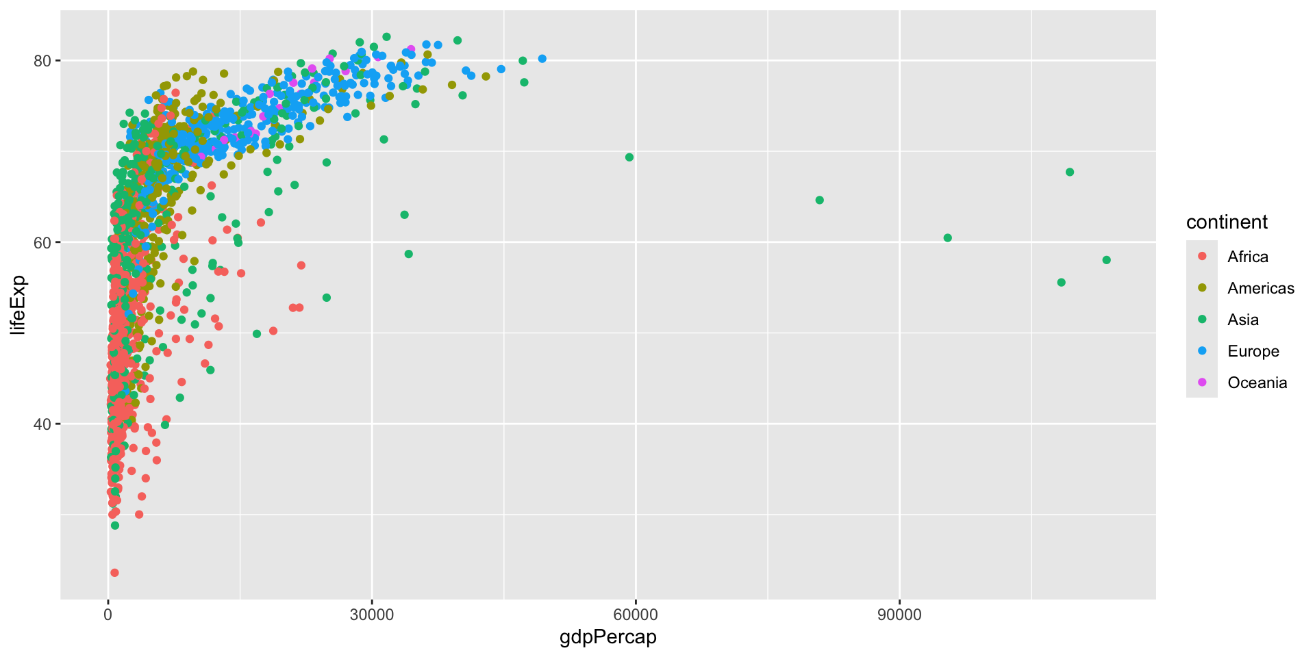
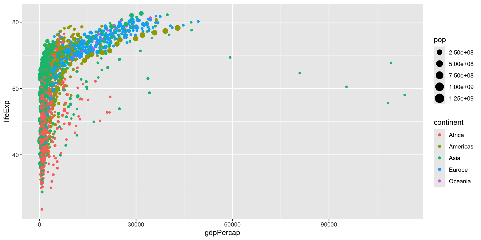
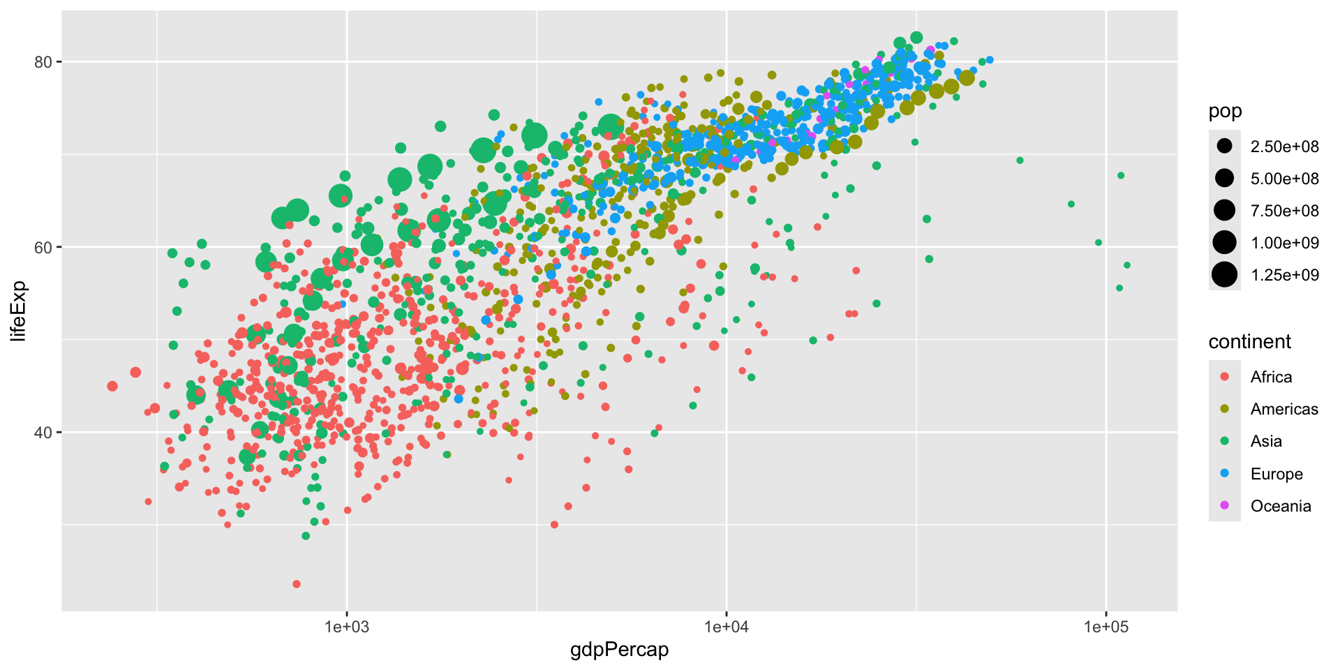
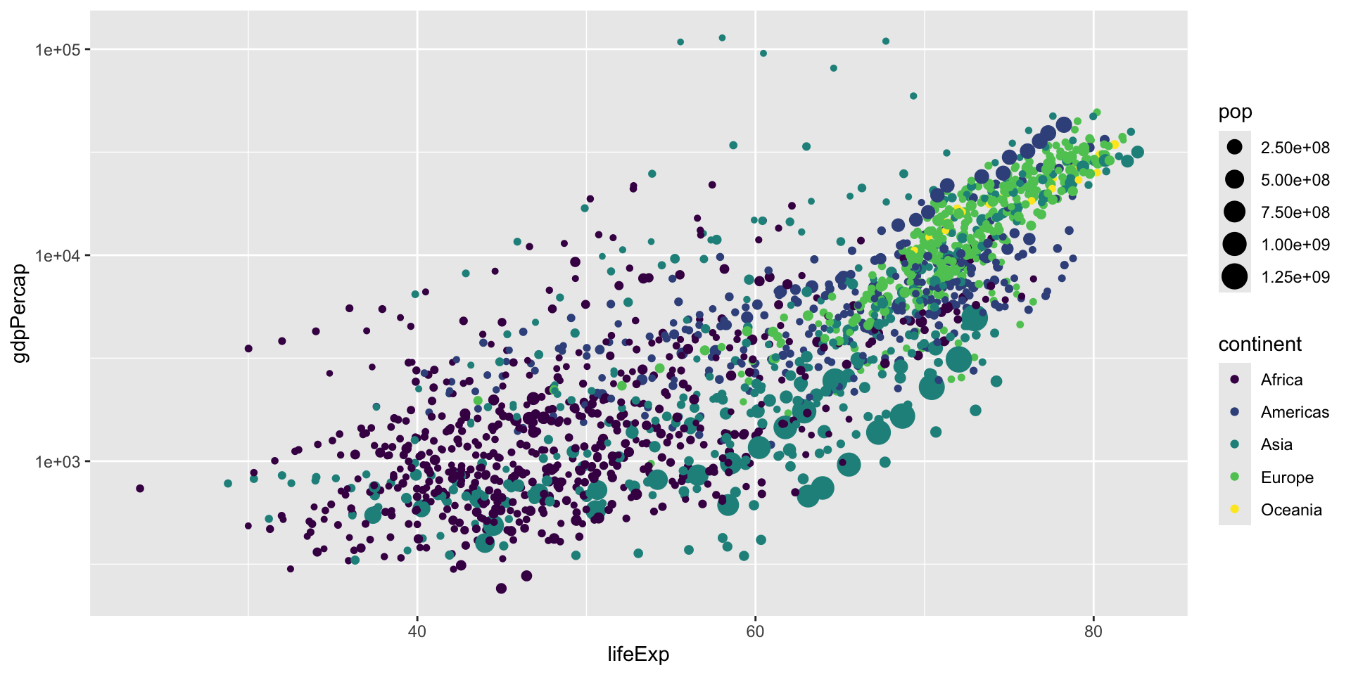
What’s the relationship between life expectancy and GDP per capita?

What’s the relationship between life expectancy and GDP per capita?
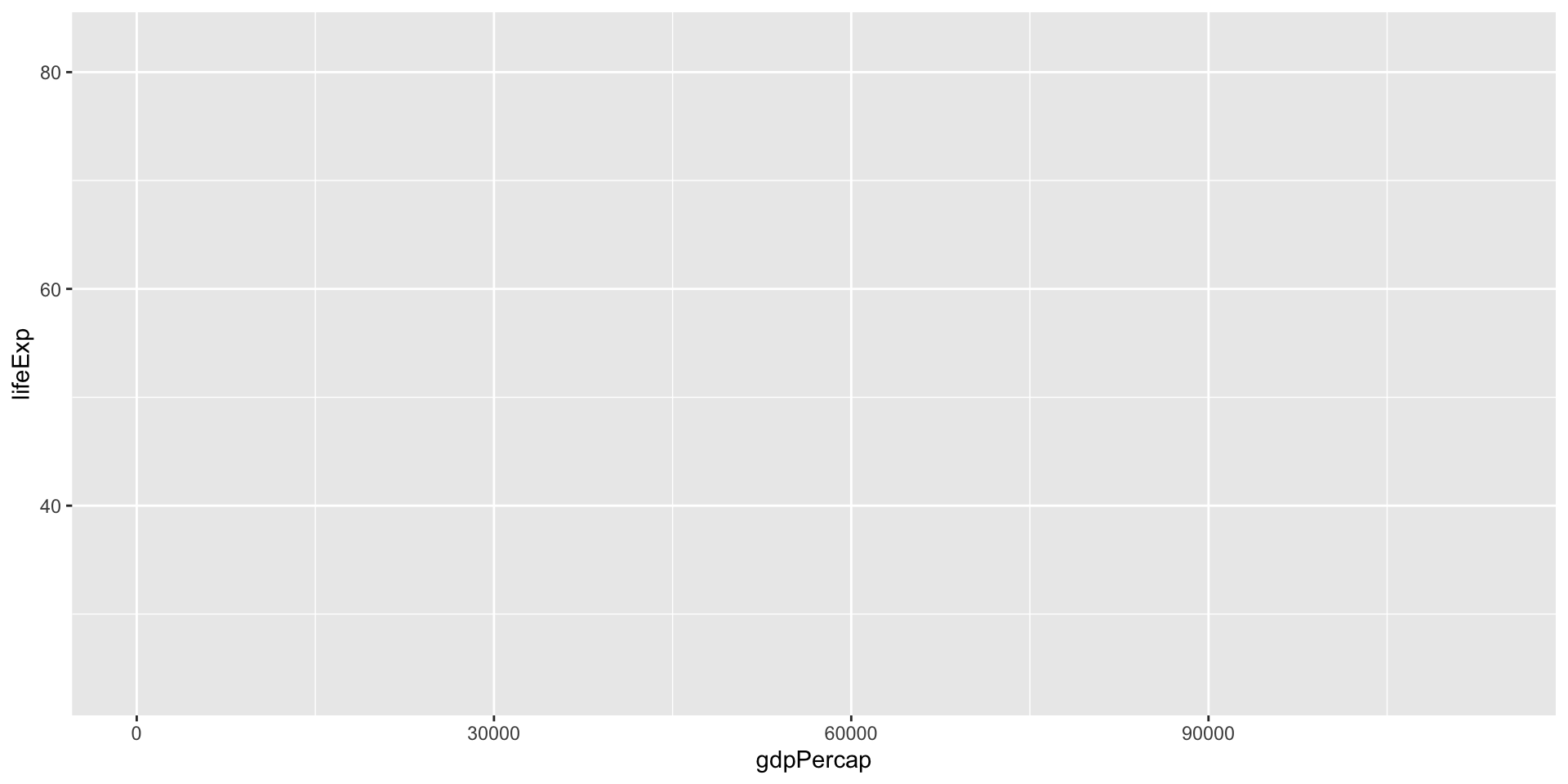
What’s the relationship between life expectancy and GDP per capita?

Mapping data to aesthetics
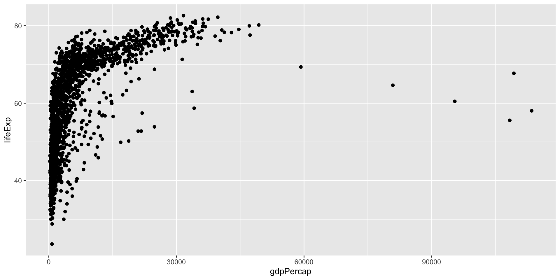
Mapping data to aesthetics
Mapping data to aesthetics

Grammatical Layers
So far we know about data, aesthetics, and geometries
Think of these components as layers
We add them to foundational ggplot() with +

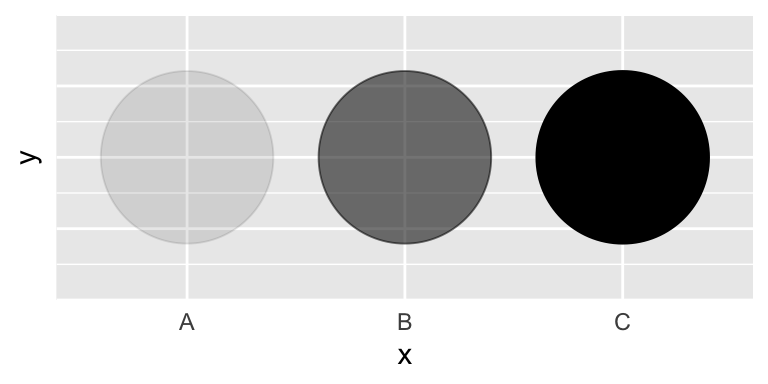
Possible aesthetics
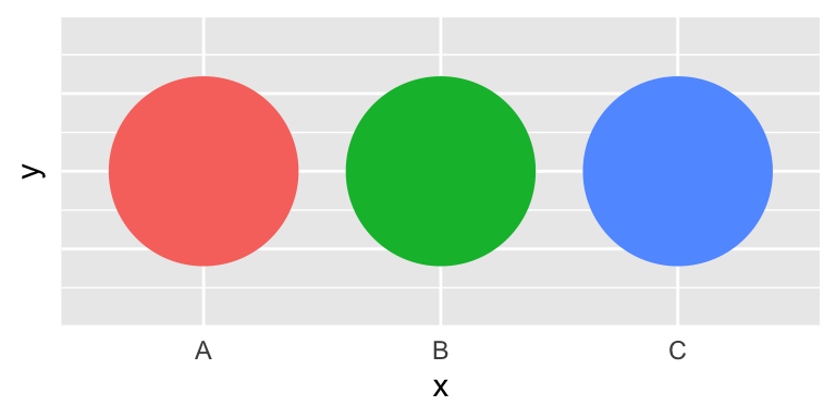
color (discrete)
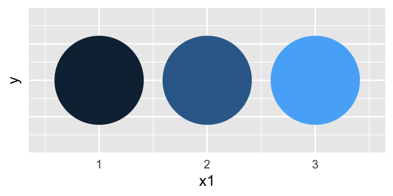
color (continuous)
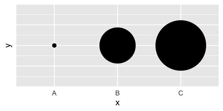
size
fill

shape
alpha
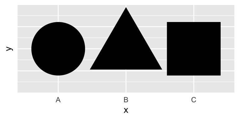
Possible geoms
| Example geom | What it makes | |
|---|---|---|

|
geom_col()
|
Bar charts |

|
geom_text()
|
Text |

|
geom_point()
|
Points |

|
geom_boxplot()
|
Boxplots |

|
geom_sf()
|
Maps |
Additional Layers
There are many of other grammatical layers we can use to describe graphs!
We sequentially add layers onto the foundational ggplot() plot to create complex figures
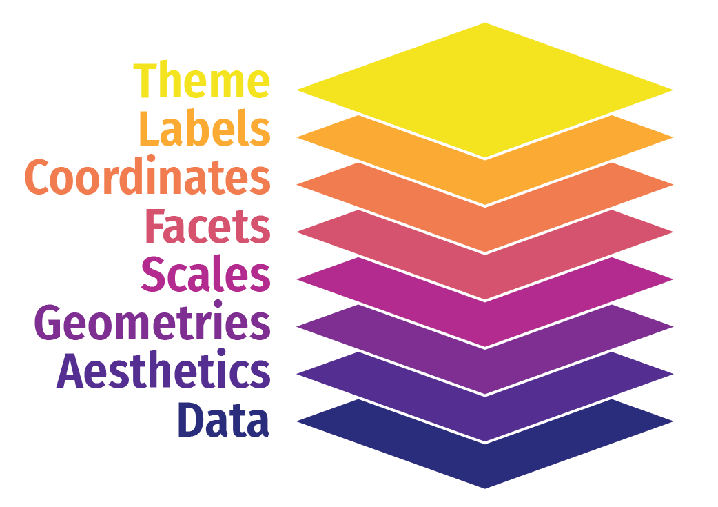
Scales
Scales
Scales
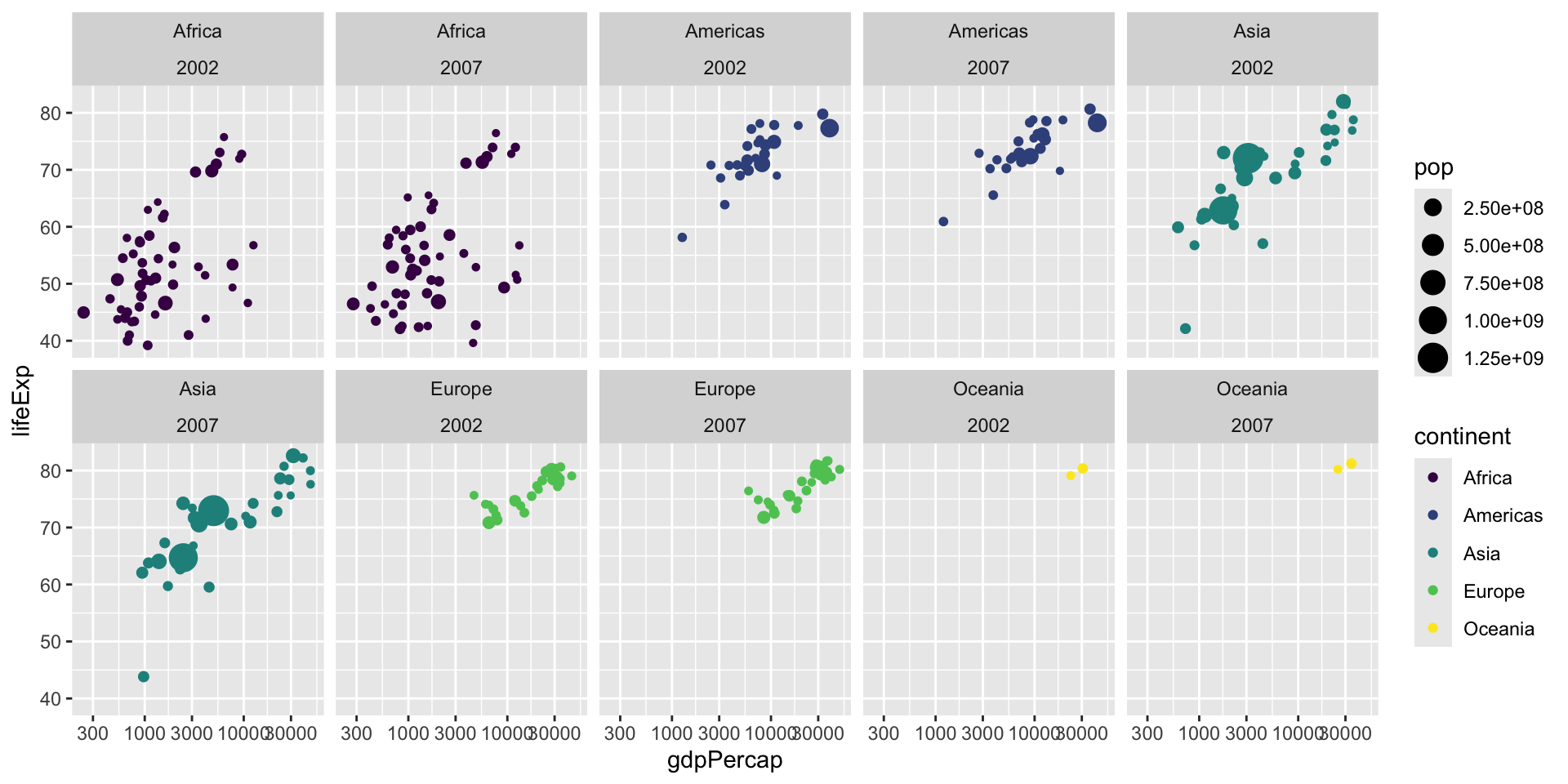
Facets

Facets
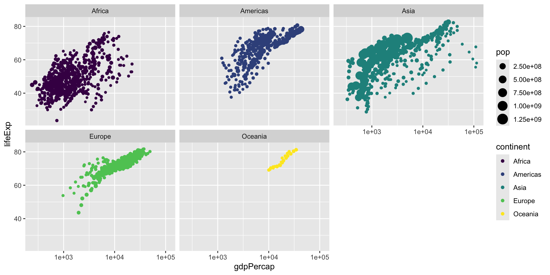
Facets
Coordinates

Coordinates

Coordinates

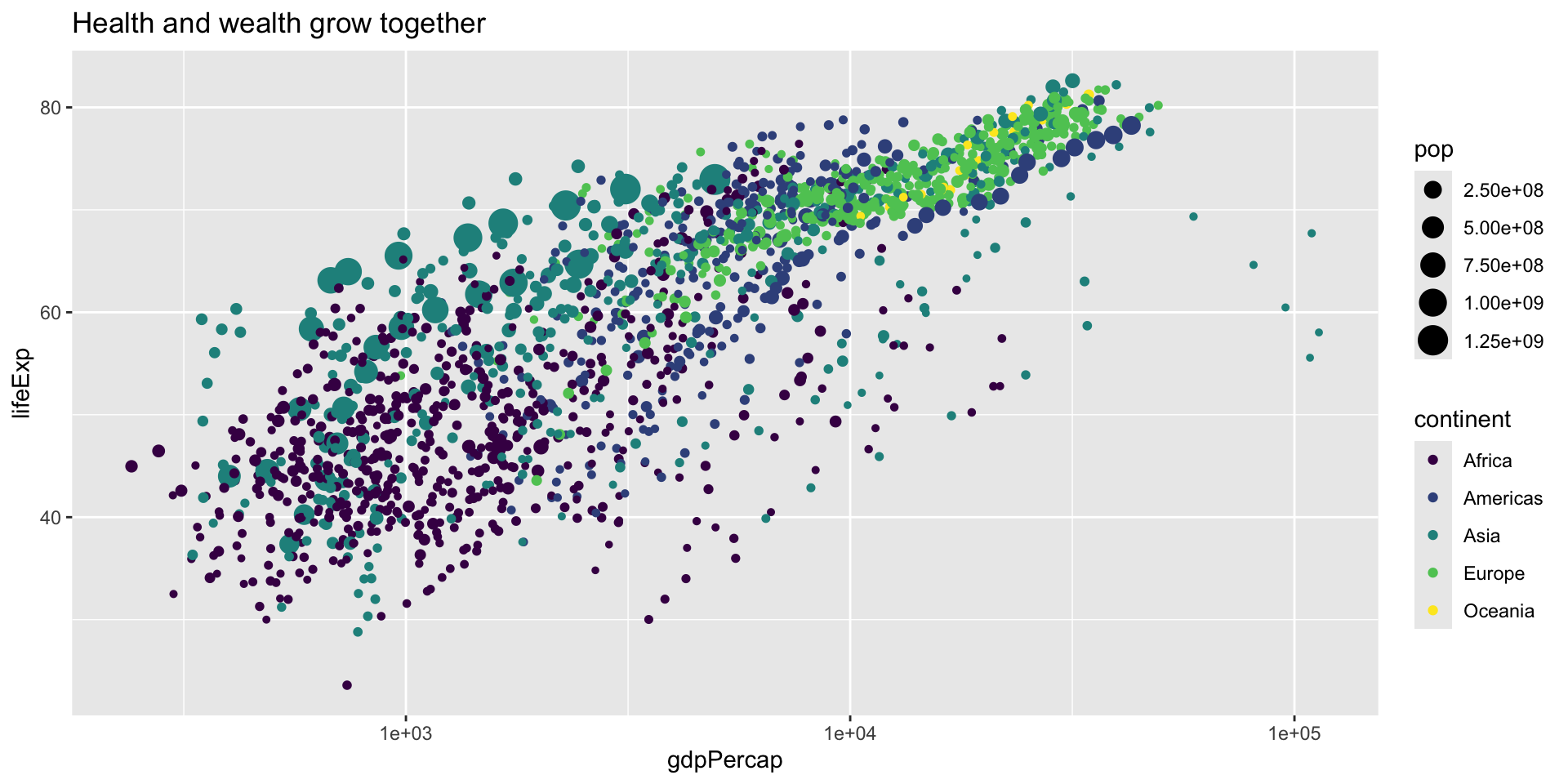
ggplot(data = gapminder,
       mapping = aes(x = gdpPercap, y = lifeExp, color = continent,
                     size = pop)) +
geom_point() +
scale_x_log10() +
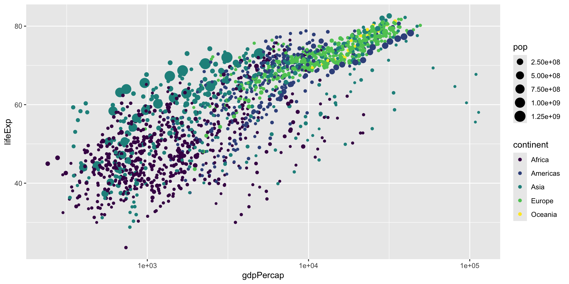
scale_color_viridis_d() +
labs(title = "Health and wealth grow together",
subtitle = "Data from the world",
x = "Wealth (GDP per capita)",
y = "Health (life expectancy)")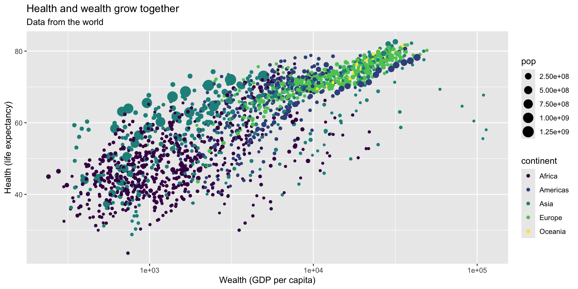
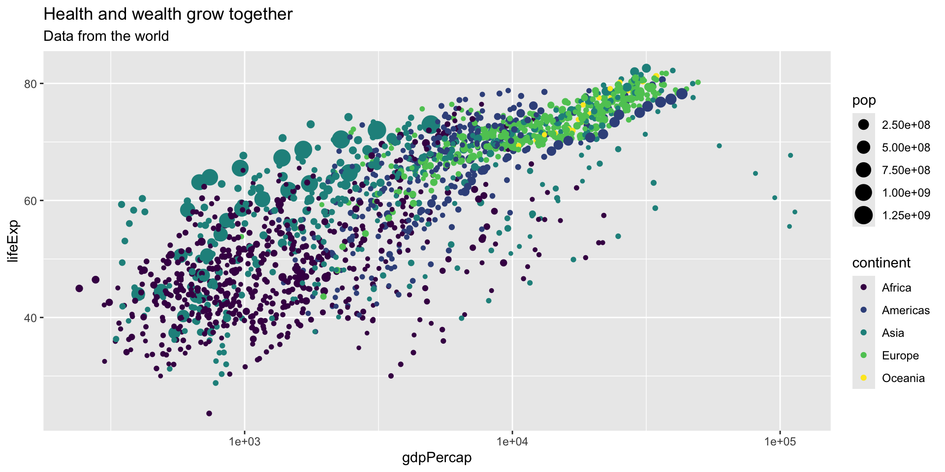
ggplot(data = gapminder,
       mapping = aes(x = gdpPercap, y = lifeExp, color = continent,
                     size = pop)) +
geom_point() +
scale_x_log10() +
scale_color_viridis_d() +
labs(title = "Health and wealth grow together",
subtitle = "Data from the world",
x = "Wealth (GDP per capita)",
y = "Health (life expectancy)",
color = "Continent")
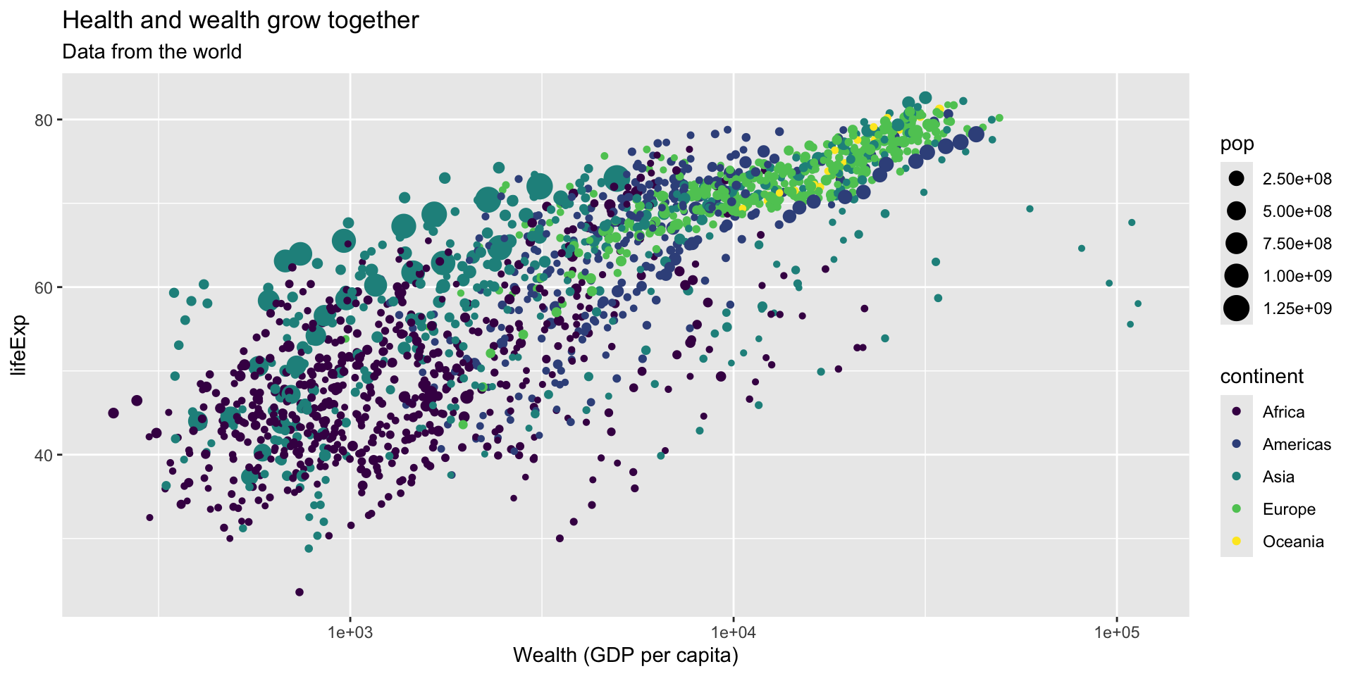
ggplot(data = gapminder,
       mapping = aes(x = gdpPercap, y = lifeExp, color = continent,
                     size = pop)) +
  geom_point() +
scale_x_log10() +
scale_color_viridis_d() +
labs(title = "Health and wealth grow together",
subtitle = "Data from the world",
x = "Wealth (GDP per capita)",
y = "Health (life expectancy)",
color = "Continent",
size = "Population")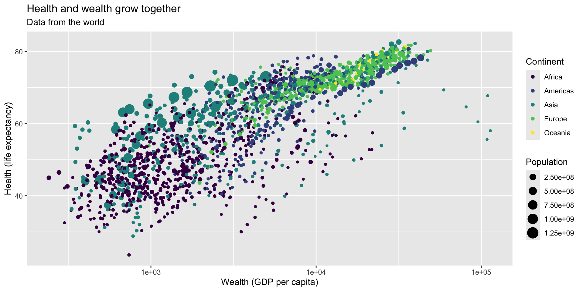
ggplot(data = gapminder,
       mapping = aes(x = gdpPercap, y = lifeExp, color = continent,
                     size = pop)) +
  geom_point() +
  scale_x_log10() +
scale_color_viridis_d() +
labs(title = "Health and wealth grow together",
subtitle = "Data from the world",
x = "Wealth (GDP per capita)",
y = "Health (life expectancy)",
color = "Continent",
size = "Population",
caption = "Source: The Gapminder Project")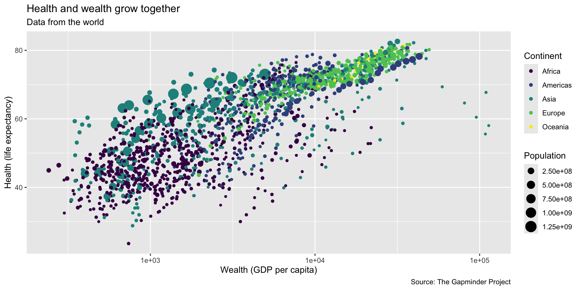
ggplot(data = gapminder,
       mapping = aes(x = gdpPercap, y = lifeExp, color = continent,
                     size = pop)) +
  geom_point() +
  scale_x_log10() +
scale_color_viridis_d() +
labs(title = "Health and wealth grow together",
subtitle = "Data from the world",
x = "Wealth (GDP per capita)",
y = "Health (life expectancy)",
color = "Continent",
size = "Population",
caption = "Source: The Gapminder Project") +
theme_dark()
ggplot(data = gapminder,
       mapping = aes(x = gdpPercap, y = lifeExp, color = continent,
                     size = pop)) +
  geom_point() +
  scale_x_log10() +
scale_color_viridis_d() +
labs(title = "Health and wealth grow together",
subtitle = "Data from the world",
x = "Wealth (GDP per capita)",
y = "Health (life expectancy)",
color = "Continent",
size = "Population",
caption = "Source: The Gapminder Project") +
theme_minimal()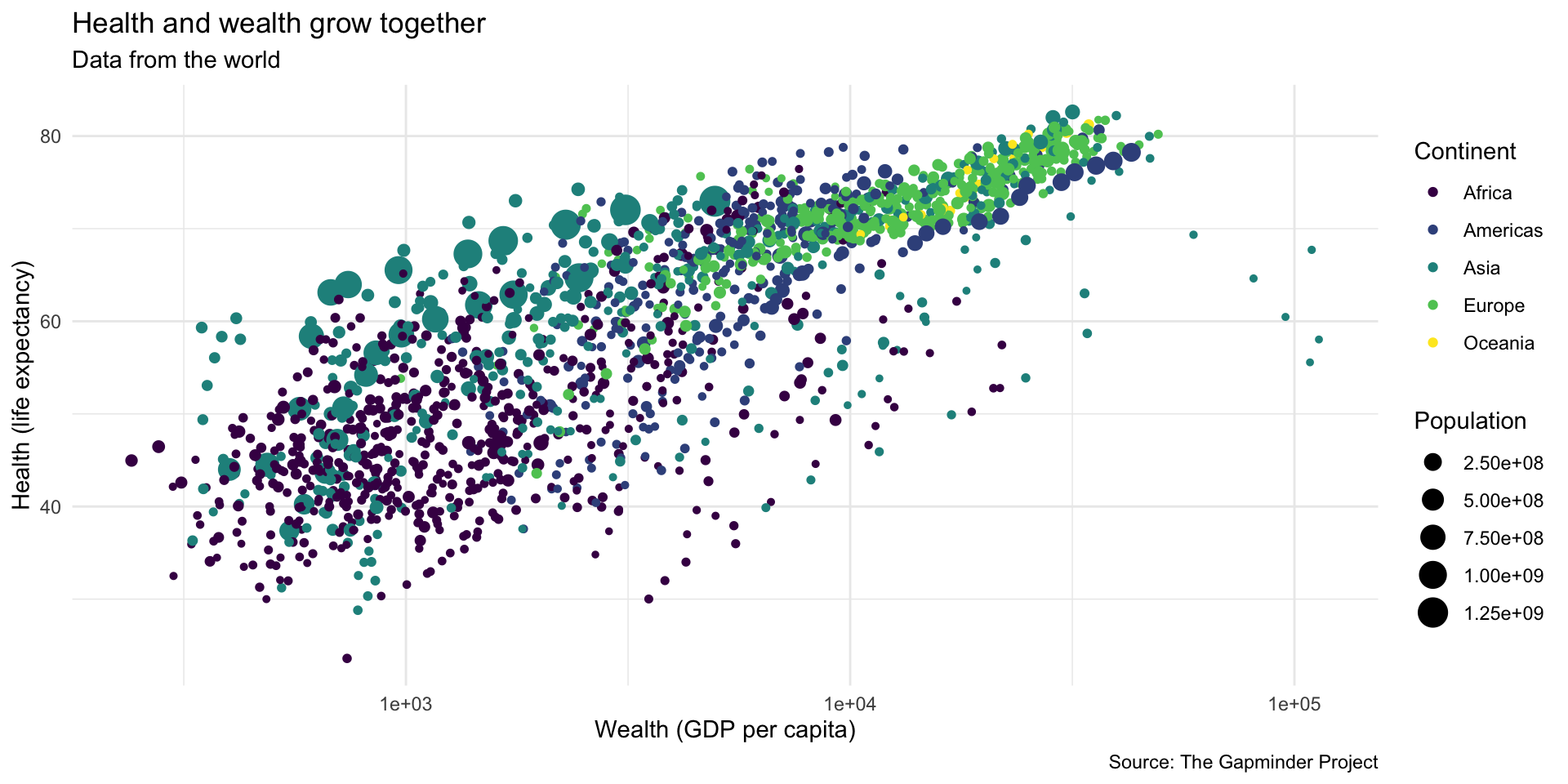
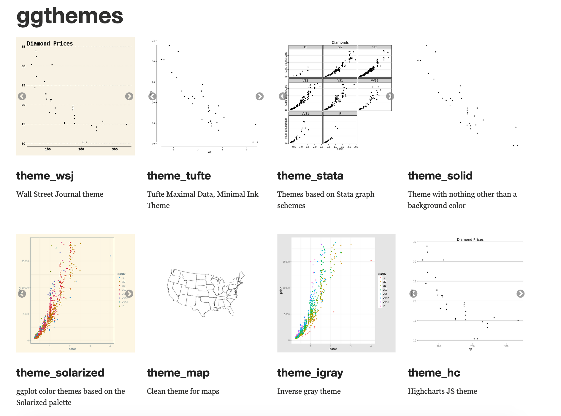
Theme
There are collections of pre-built themes online,
like the {ggthemes} package
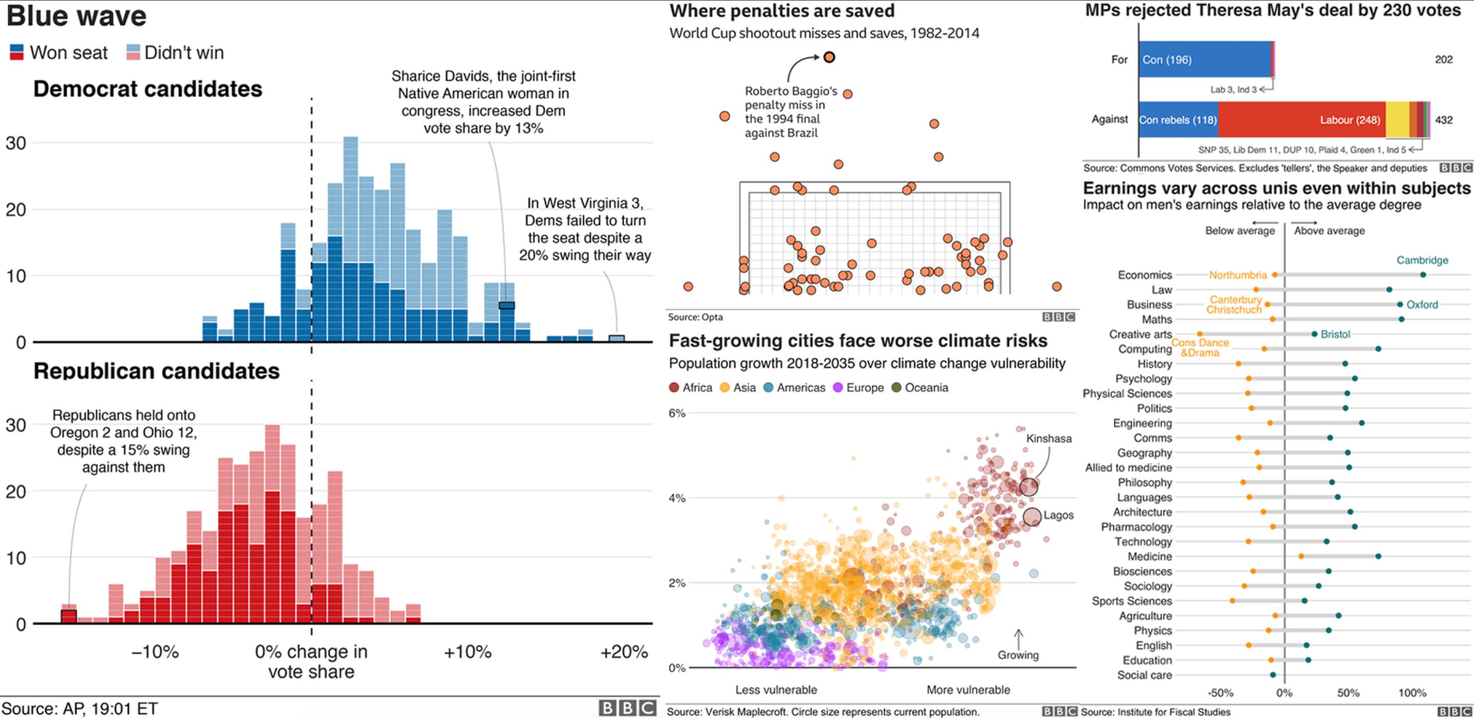
Theme
Organizations often make their own custom themes, like the BBC
Theme options
Make theme adjustments with theme()
There are a billion options here!
ggplot(data = gapminder,
       mapping = aes(x = gdpPercap, y = lifeExp, color = continent,
                     size = pop)) +
  geom_point() +
  scale_x_log10() +
  scale_color_viridis_d() +
  labs(title = "Health and wealth grow together",
       subtitle = "Data from the world",
       x = "Wealth (GDP per capita)",
       y = "Health (life expectancy)",
       color = "Continent",
       size = "Population",
caption = "Source: The Gapminder Project") +
theme_minimal()
Theme options
Make theme adjustments with theme()
There are a billion options here!
ggplot(data = gapminder,
       mapping = aes(x = gdpPercap, y = lifeExp, color = continent,
                     size = pop)) +
  geom_point() +
  scale_x_log10() +
  scale_color_viridis_d() +
  labs(title = "Health and wealth grow together",
       subtitle = "Data from the world",
       x = "Wealth (GDP per capita)",
       y = "Health (life expectancy)",
       color = "Continent",
       size = "Population",
caption = "Source: The Gapminder Project") +
theme_minimal() +
theme(legend.position = "top",
plot.title = element_text(face = "bold"),
axis.title.y = element_text(face = "italic"))
There are many, many more options
See the {ggplot2} documentation for complete examples of everything you can do
Your turn #1: untidy temperatures
1. What makes this data untidy? Describe.

- Variables are columns
- Observations are rows
- Values are cells
| date | station1 | station2 | station3 |
|---|---|---|---|
| 2023-10-01 | 30.1 | 29.8 | 31.2 |
| 2023-11-01 | 28.6 | 29.1 | 33.4 |
| 2023-12-01 | 29.9 | 28.5 | 32.3 |
Multiple observations (temperature recordings) per row
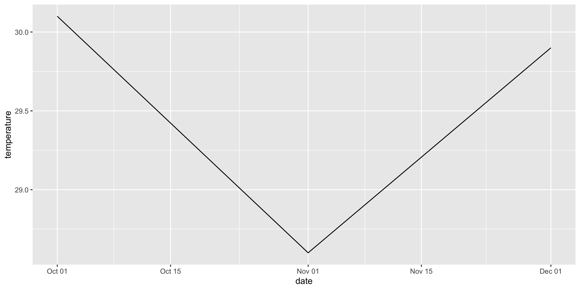
Your turn #1: untidy temperatures
- Make a plot that tracks the temperature changes over time for
station1only. Usefilter()to select the station and usemutate()in combination with theas_date()function to convert the date variable from character to a date format. into a date. Usegeom_linefor the plot.
Your turn #1: untidy temperatures
- Now use the the non-filtered data frame with all stations. Add another aesthetic layer to your previous plot, so that your new plot allows to differentiate temperature changes between the different stations. Tip: Use
color
